Frontend & UI
Square Root
One design. Every phone. Same proportions.
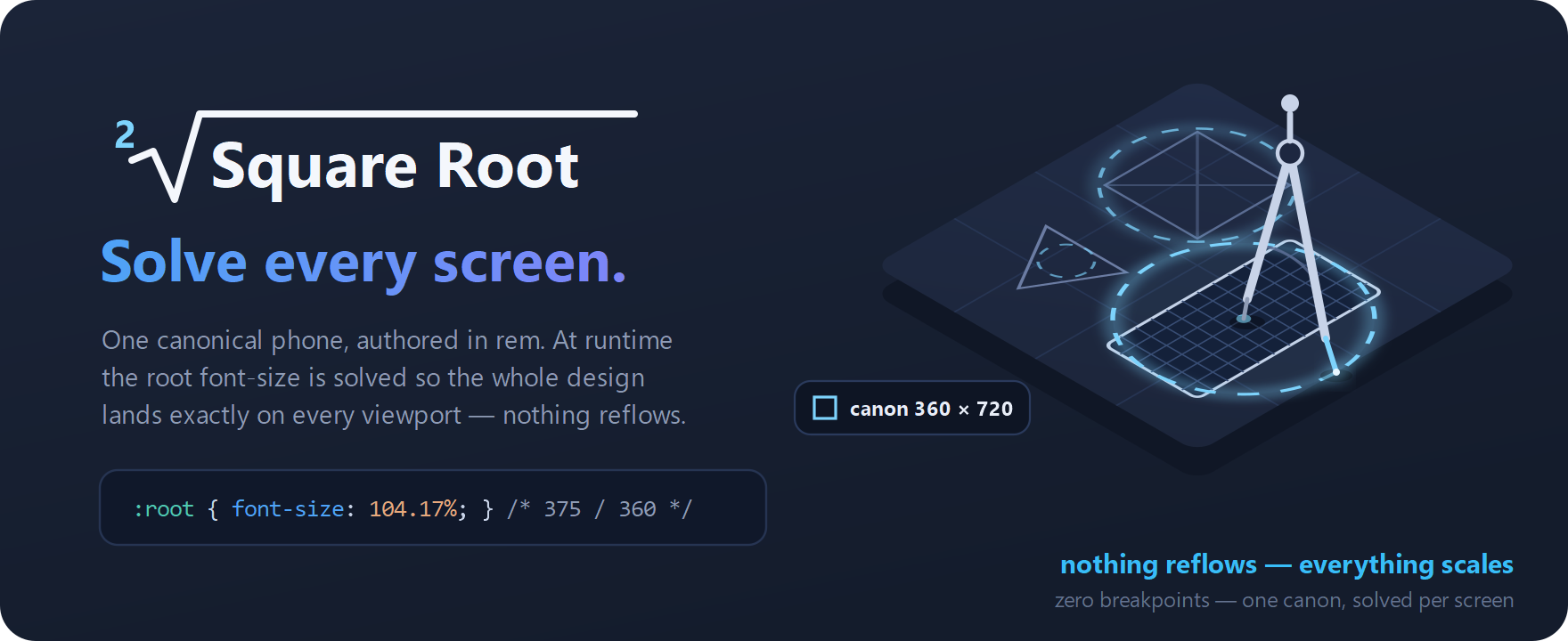
A mobile-first layout framework that stops fighting screen sizes. You design once against a canonical 360×720 phone built on a 60px finger unit — the smallest block touch research shows a finger can reliably hit — and Square Root solves the root font-size so that design fits any viewport exactly. Identical proportions on a 320px handset and a 430px flagship, without a single breakpoint. Invented by Neo Nosrati.
- Scales the whole composition instead of re-flowing it — proportion and rhythm survive any screen
- Built on researched touch targets, so nothing sized in these units can be too small to tap
- Scroll-snap layer for swipe-between-columns, scroll-within-column interfaces
<div class="sqr-w-4 sqr-h-2 sqr-mt-1">One finger = one unit.</div>